- Captain America Fortnite Outfit Guide - October 3, 2022
- Best Spiderman Themed Bikes for Kids - October 3, 2022
- Best Iron Man Hand Guide - September 30, 2022
Since I was a little kid, I have always liked fan art. Each person has a different perception of the world, and when you have numerous authors creating work on the same topic, you can get some wondrous results. Fans can create disturbing or comical pieces that company artists cannot make. So, they have much more liberty in making these drawings.
The same goes for Spiderman fan art. Although I’ve always liked the work of guys such as Mike McKone and Morry Hollowell, who drew the Spiderman comics, these guys were always constrained by the Marvel company policy. Marvel is very lenient and doesn’t mind taking chances when it comes to their storylines and artwork, but they still cannot compare to fans’ ideas.
Now that I’m all grown up and have enormous experience with comic books, I want to go back to my childhood and revisit all this amazing Spider-man fan art. In this article, I will review some of the best Spider-Man fan art ideas I’ve found online and share my thoughts on them.
Key Info Up Front
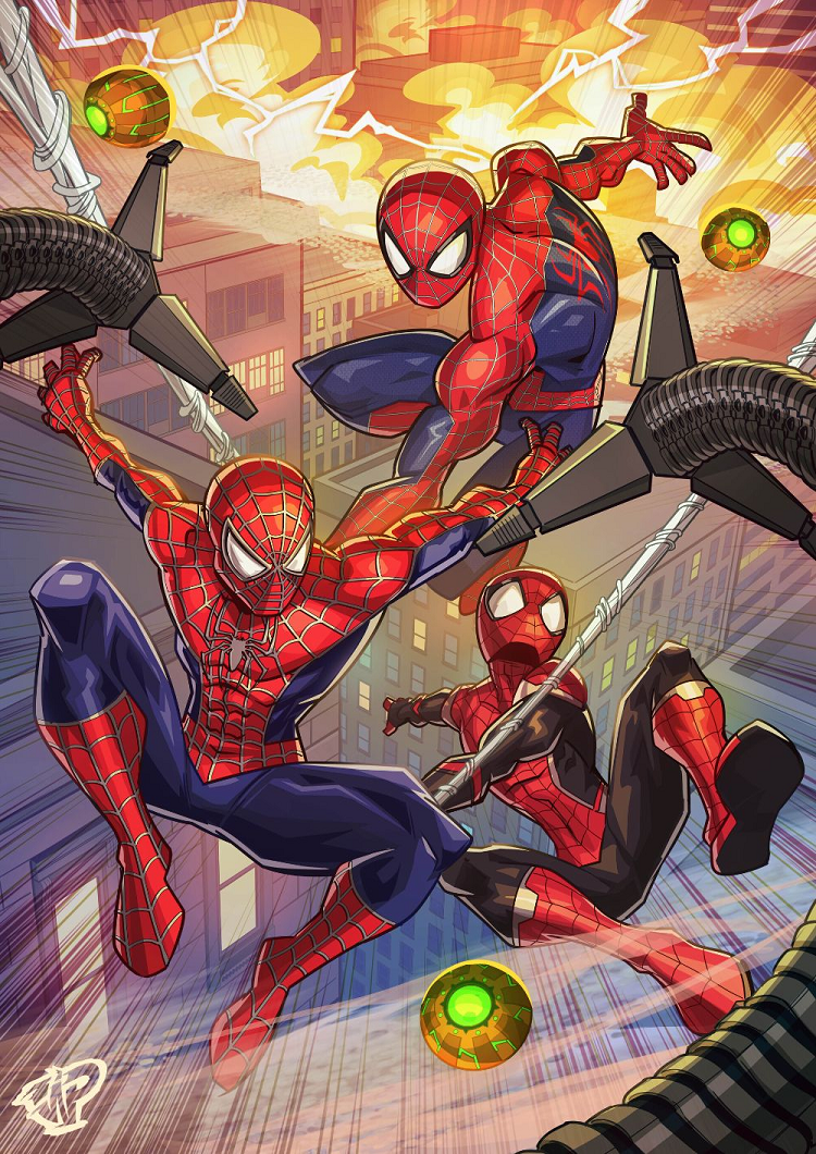
Loyal Spider-man fans have created some amazing comic book art over the years. My personal favorite is made by Twitter user Kelvin Does Things, where he portrays Tom Holland, Andrew Garfield, and Tobey Maguire on one massive poster. It shows how far some fans are willing to go to commemorate Spidey.
Work such as this shows that many talented people are out there. You can easily download these pieces (most of them are free, posted on social media), print them, and hang them on your wall. That way, you can always have Peter Parker close to your heart.
What Were the Selection Criteria?
Honestly, this list is mainly based on my personal preferences. I went through hundreds and hundreds of artwork, selecting the ones that suit my palette. Some of them might look quite strange or not even that polished.
If I were to generalize, here are the main things I considered when I made the compilation:
- · The way an artwork looks. Is it polished enough? How do the lines and colors look? How many details does it have?
- · Uniqueness factor. A piece has to be significantly different from other fan artwork posted online. In other words, when you open Google, you should easily spot it in a plethora of posters.
- · Would I allow my kids to have it on their walls? Is it too disturbing, too graphic? Is it suitable for people of all ages? Let’s be honest; Spiderman posters are much more common among elementary school kids than teenagers, so you need to be careful about what they’re putting in their room.
As you can see, numerous factors went into consideration. Keep in mind that I broke my own rules several times over. Simply put, I couldn’t omit some of the masterpieces from the list, so I had to add them even if they were too graphic or the artist didn’t have the perfect technique.
See also: Spider-Man Characters Guide
1. “It’s what we do” by Kelvin Does Things
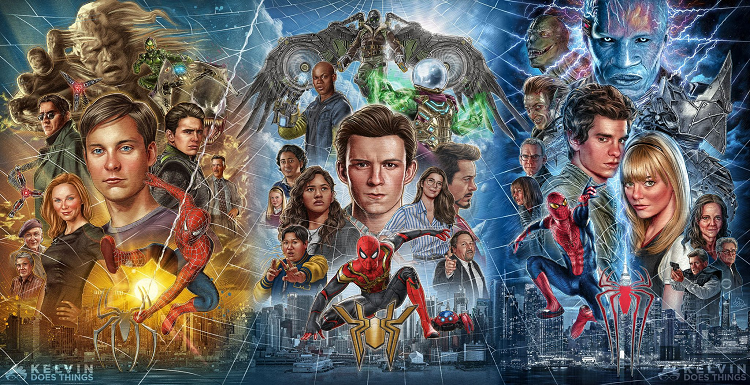
Let’s start with my favorite piece. Although this one is a bit messy, I love its complexity. There is so much going on the poster, and if you’re a true fan of Spiderman movies, you’d like to have this one on your wall.
As I’ve already mentioned, it shows Tom Holland, Andrew Garfield, and Tobey Maguire, as well as other characters from the first three modern iterations of Spiderman. It features other iconic actors such as Marisa Tomei, Willem Dafoe, Alfred Molina, Emma Stone, and many others.
All in all, this is an amazing piece of art, and I love how much time the creator invested in it. Aside from different actors, each section features a cool, unique background.
Pros
- Incredibly detailed piece of art. The creators invested so much time into this one.
- It pays homage to all the actors that brought Spiderman to life and gave us hours and hours of incredible entertainment.
Cons
- I don’t have anything bad to say about this one.
2. “Spiderman Flying Over NY taxi” by an Unknown Author
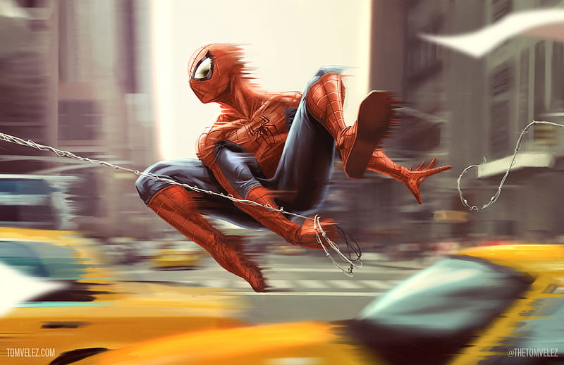
This is one of numerous fan art pieces you can find at Peakpx.com. Although I’m generally trying not to add no-name pieces, this one caught my eye. It showcases Spiderman as he’s web-slinging from a building to a building just above NY rush hour. To add to the feeling of a big city, the artist decided to add yellow cabs, characteristic of this city.
The fan art is dynamic due to the blur effect. Spiderman’s body is almost trailing behind, which can also be said for the cabs moving around. If you check the background, you will notice that the buildings are also blurry adding to the overall intensity.
Lastly, I also have to mention that the combination of yellow, blue, and red against a gray background goes well together.
Pros
- Great color combinations; I love the addition of yellow.
- The image is very dynamic, as it should be for action hero posters.
- I’m especially impressed with what the web looks like.
Cons
- I think adding one or two people in the background would further enhance the feeling of a great metropolis.
See also: Spiderman-Themed Crocs Guide: Top Picks and What to Look For
3. “Spiderman with Doctor Octopus’ Mechanical Appendage” by Eduardo Silvaa
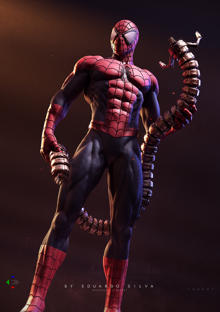
This is one of those instances where I broke my selection criteria rules. As I said, I tried to make a list with as many kids-friendly artworks as possible. However, I still had to add this one, although it is a bit too gritty for younger viewers.
The picture shows Spiderman holding one of Doctor Octopus’ appendages. Although this is a CGI model, it still looks similar to a traditional drawing. The superhero has numerous small details, and you can see every muscle.
The shading is also incredible, and I like how ominous the appendage looks in Spiderman’s hands. Although this is a bit darker portrayal of the character, keep in mind that this is just a mechanical appendage and that Doctor Octopus wasn’t harmed during the making of this model.
Pros
- Lots of details to die form. I especially like Spiderman’s costume and the muscles beneath it. The mechanical appendage also looks very polished.
- Spiderman looks very intimidating, almost like a serial killer, which brings an entirely different dimension to his character.
Cons
- The fingers of Spiderman’s left hand are almost merging with the appendage, making it look a bit awkward.
4. “Deadpool and Spidey” by Chichiriyuki
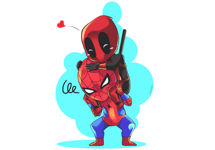
Although Spiderman was always popular, the same cannot be said for Deadpool. This character has only recently gained traction with the latest Marvel movies. In this particular image, we can see the two of them together, with Deadpool sitting comfortably on Spiderman’s shoulders.
It is a chibi art style with overly pronounced heads and facial expressions. Spiderman is visibly annoyed, while Deadpool sits on top of his head, looking comfortable, almost as if he’s in love. While some might think this pairing is a bit odd, I like it. Remember that both characters are goofy in their regard, unlike most other superheroes that take things too seriously.
This is a photo with transparent background so that you can use it with other images and scenes. You can combine it with other media and do all sorts of fun stuff with it.
Pros
- I’m a big fan of the chibi art style, so I had to add this to the list.
- Having Spiderman and Deadpool in the same image is simply incredible.
- I love the dynamic between the two.
Cons
- If you’re looking for high-quality art, this isn’t necessarily it (although you can see that the creator invested lots of time in making this piece).
5. “Shields Up” by Ryan Finley
Here is another cool mash-up. Although this particular image doesn’t feature the second character, Spiderman does wear Captain America’s shield paying homage to one of Marvel’s greats. Peter Parker is shown down on one knee, as if observing the surroundings, while his left arm is high above his shoulders, holding the shield.
Although this isn’t my favorite piece on the list, I like the slight change of pace. It is quite a unique drawing, setting it apart from other fan artwork in this article. Nevertheless, Spiderman has nice shading and colors. However, I must mention that his feet and head look too large.
Pros
- Since the same colors are used, it took me a few seconds to realize that Spiderman is holding Captain America’s shield. I think this is a nice swerve.
- I like how the webbing is done.
Cons
- The artwork looks a tad bit too simplistic.
- The superhero’s feet and head are a bit too large.
See also: 22 Best Spiderman Backpacks [2022]
6. “Street Spiderman” by Jimmy Cormick
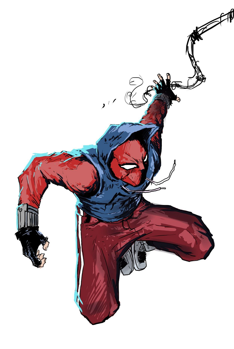
If you ever wondered what Spiderman would look like if he went outside to play basketball, you now have the answer. The character is portrayed in basic street clothes, making him look much more relatable. Although he’s still wearing a mask and has a large spider logo across his chest, there aren’t any indications that this is a popular superhero.
Has wears a blue hoodie shirt over a long red shirt and has red pants. Peter Parker has gray sneakers and black gloves. He is not going around New York City on his feet, as you can see spider web on his left. I love the color combinations on this drawing; all the muscles and body parts look dope.
While this drawing doesn’t have any background, and you could argue that it would benefit from more objects, Spiderman’s body is done really well. There’s lots of shading, and colors match well with each other, providing depth to the model.
Pros
- This is literally how an artist would draw Spiderman.
- I love the street clothes as they make the character much more relatable.
- The ropes on the hoodie look incredible.
Cons
- The spider string looks awful.
- I would love to see something more in the background.
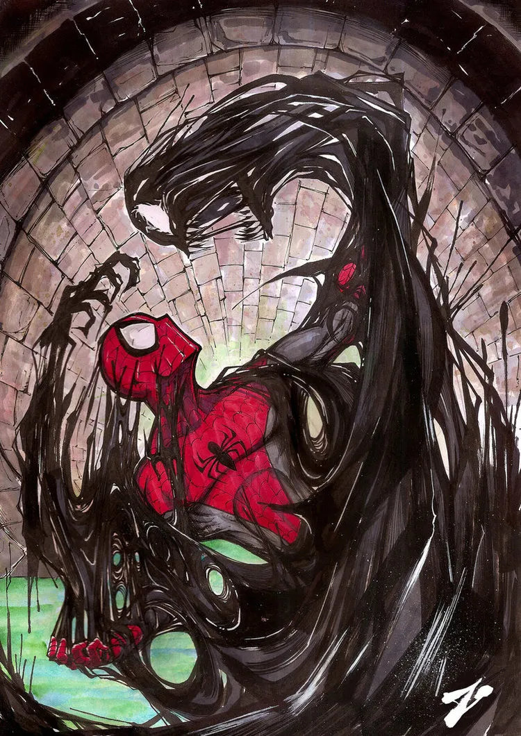
7. “Venom” by ConvictedRex
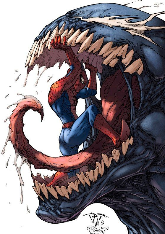
I found this particular drawing on Pinterest. Although the artist called it “Venom,” it features both this character and Spiderman. This is easily one of the grittiest, gnarliest images on the list.
Venom’s model is much larger than that of Spiderman. His mouth is wide open, showing numerous crooked teeth and a slimy tongue. Spiderman, much smaller than Venom, is inside his mouth, struggling to keep them open and thus avoiding being consumed.
This particular piece shows a dichotomy between the two entities, with Spiderman as a protector and Venom as this relentless, destructive force. It also shows the inner struggle that Peter Parker is constantly going through when fending all these demons, endangering his physical and mental stability.
Both of these models are incredible. You can notice how much power Venom is exerting as he’s trying to shut his mouth, and the same can be said for Spiderman, who is desperately trying to open them. Their muscles are under massive tension, and there is lots of shading.
Pros
- Quite literally a masterpiece. Although I’ve complained about the lack of background in the previous entry, you won’t even notice that the background is missing on this one. It just shows how much stuff is going on in the drawing.
- Venom is hideous in a good way. He reminds me of the Aliens from the movie bearing the same name in many ways. His crooked teeth and slime make him look so devious.
Cons
- I don’t have any complaints with this one.
8. “Spider-man vs. Venom” by Zuleta Miguel
The thing I like about this particular entry is how Venom looks. In many ways, he doesn’t look like a being. The art style reminds me of how great art masters painted nature with black, gray, and white tones.
On the other hand, Spiderman looks the same way as in many other fan art pieces. His costume is rather straightforward, emphasizing his physical traits. However, I must mention that the blue sections of his costume are slightly altered. They look almost gray, which helps the costume merge with Venom. I like this small bit because it reduces the visual contrast between the two.
Pros
- A great background that adds to the overall dynamics of the image.
- Nice combination of colors.
- Different techniques are used in different parts of the drawing.
Cons
- Despite the artists successfully combining colors and styles well, the piece still feels a bit convoluted and messy.
9. “Tony Explains to Peter the Features of His New Suit” by LitanaYasha
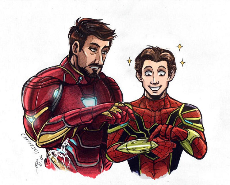
I simply loved the relationship that Iron Man and Spiderman built throughout the movies. Tom Holland and Robert Downey Jr. are a perfect duo, and fans had a strong urge to commemorate their friendship through various fan-made items and art. This drawing is the best example of that.
Peter Parker and Tony Stark are standing side by side as Tony explains the new suit to his friend. Although Iron Man is reserved and borderline bored with the technology, Spiderman’s eyes are sparkling as he’s checking the new suit.
At first glance, their suits appear very similar. However, when you look closer, you will notice that the costumes have different patterns and utilize slightly different colors. Even their skin complexion and hair, although similar in color, are not the same.
Pros
- The idea behind the image is as wholesome as it gets. Everybody loves the duo, and it is always nice to see them together.
- There’s also a story behind the art, which always adds to its value.
- The colors and patterns are very similar yet very different.
Cons
- I don’t like their hands.
10. “Spiderman – Rage Series” by BOSSLOGIC
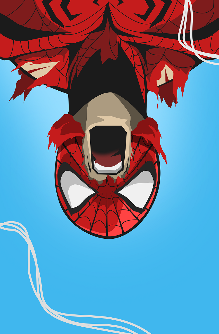
This picture is from a larger set called “Rage Series,” featuring several superheroes. Out of all these characters, Spiderman left the most profound impression on me. The artwork depicts Peter Parker hanging upside down, with his mask torn and a few cuts on his body, yelling his lungs out.
The drawing is quite disturbing. I’m unsure whether it’s because Spiderman appears to be yelling, all these cuts, or because he is upside down, making Peter Parker appear tortured.
As for the art style, it looks pretty clean. The artists used a simple light blue background that goes well with the character model. There are also a few strings of web hanging around, and it looks as if Spiderman has no control over them.
Pros
- It looks very visceral and disheartening. I will go as far as to say that I like the symbolism on this one. It might indicate that the life of a superhero is much harder than we could ever comprehend. Then again, the artist knows best what they want to say with this drawing.
- The colors and style are very simplistic.
- While there isn’t much going on in the background, I think it fits well with Spiderman’s model.
Cons
- To me, this drawing is very disturbing, and I’m not sure if I would allow my kids to have it in their bedroom.
11. “Spider-Man: Homecoming” by Sergey Grunin
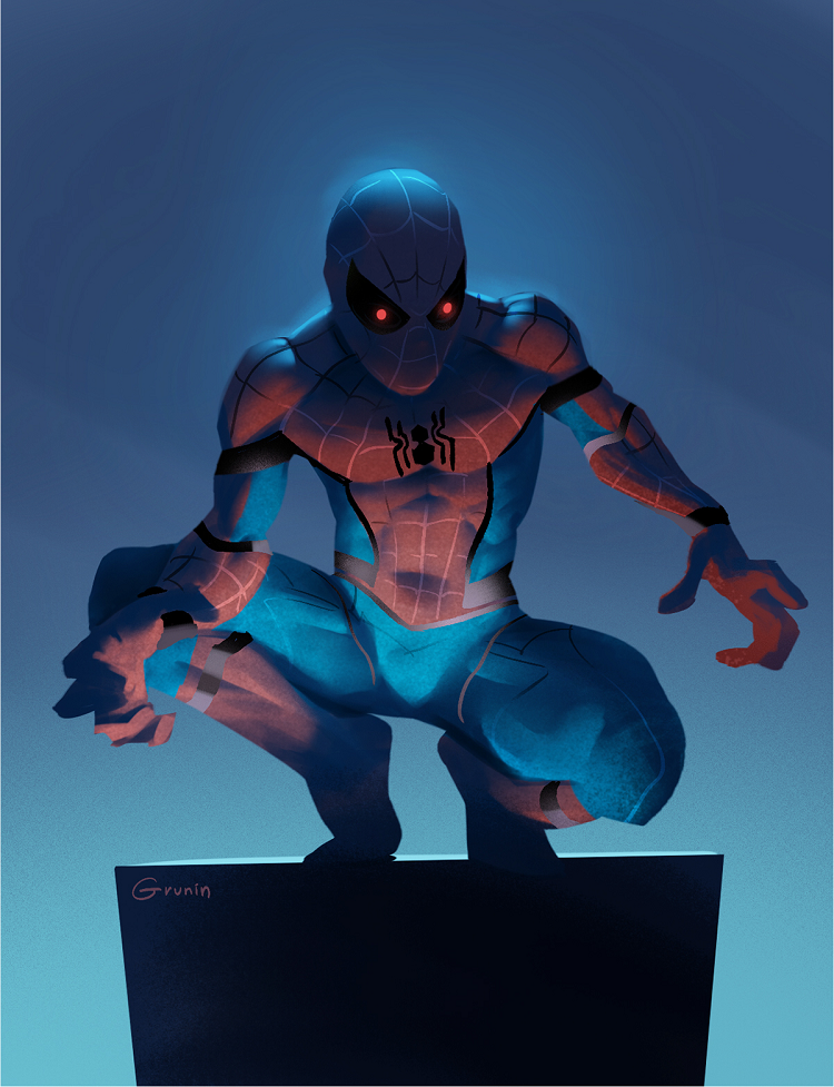
On the surface, Spiderman always looked like this lighthearted character. He is always joking around, whether with his friends or enemies. Alas, his story is tragic in many ways. Peter Parker had to endure enormous hardships to continue being a superhero, which would also cost him the love of his life and a few friends.
So, I’m not surprised when I see creations such as this. It depicts Spiderman in a completely different light, in a way most fans are not used to seeing him. The superhero is squatting above a black rock, holding his hands as if they were claws. His eyes are red and predatory, and the tense muscles indicate that Spiderman is ready to pounce.
As if that wasn’t enough, the superhero is in the shadows, looking like he’s using them as a cover. I really like this photo as it shows a much darker side of the superhero, possibly indicating that there’s an animal in each one of us regardless of how we show ourselves to the public.
Pros
- A very dark, animalistic portrayal of the superhero that changes everything we know about Spiderman.
- He is lurking from the shadows, and the artist did a great job of showing that in his costume.
Cons
There are no cons to this one. I like it.
12. “Spider-ssemble” by DuckLordEthan
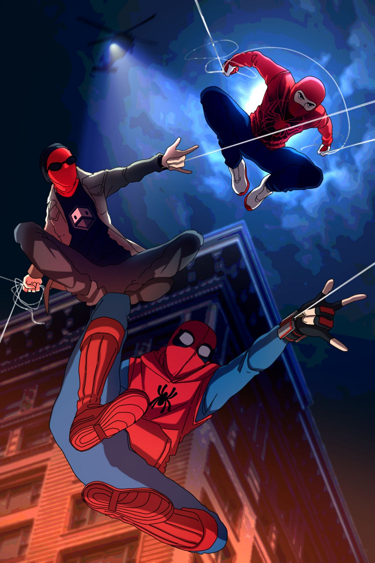
Almost every Spiderman fan I know is happy that we have three iterations of Spiderman the movie in the last 20 years or so. No matter which actor you prefer out of these three guys, you probably have a great appreciation for what they’ve brought to the table.
“Spider-ssemble” shows three iterations of Spiderman in their street clothes before they received an official costume. It is a cool moment when each one of these protagonists just discovered their power, and the picture perfectly depicts that youthful exuberance as all their Spider-men are in drawing together, jumping from a building to a building.
Pros
- If you check the sky, you will notice how cool it looks.
- Basically, the artist focused on red, blue, and black shades, with a bit of brown. These color combinations are perfect together.
- A helicopter shining a light on our young superheroes is a welcome touch.
Cons
- The building in the background looks as if it was cut out from a different drawing.
13. Andrew Garfield Spiderman by symphonikaa
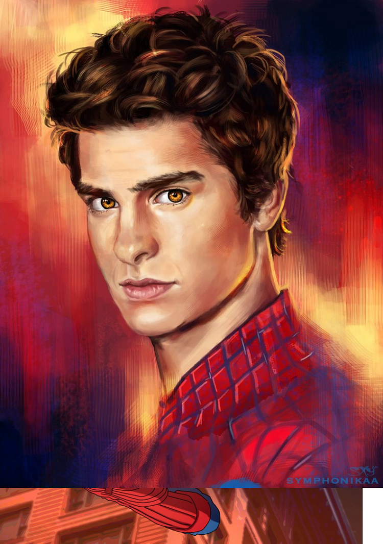
When you check Google for Spiderman Fan Art, this is one of the first things that pops up. It is an amazing drawing of Andrew Garfield as a Spiderman. It is a portrait that perfectly captures the actor’s face.
Anyway, it shows Andrew from his shoulders up. He is without a mask, and only his shoulders are covered in Spiderman costume. Although the outfit looks a bit clumsy, his face is just perfect. Every single line is in place; whether we’re talking about his mouth, nose, eyes, or hair, everything is flawless.
The background adds to this image. It combines various shades of orange, yellow, and purple that meld perfectly with his face. Anyway, I’m really impressed with this work.
Pros
- Every single detail on Andrew Garfield’s face is perfectly drawn. Furthermore, his face is perfectly symmetric, making it look as if this is a photo of the actor.
- The background is incredible, and it adds to the artwork.
Cons
- I don’t like the shoulders and the neck area; they are not that good.
14. Tobey Maguire Spiderman by Yucanimations
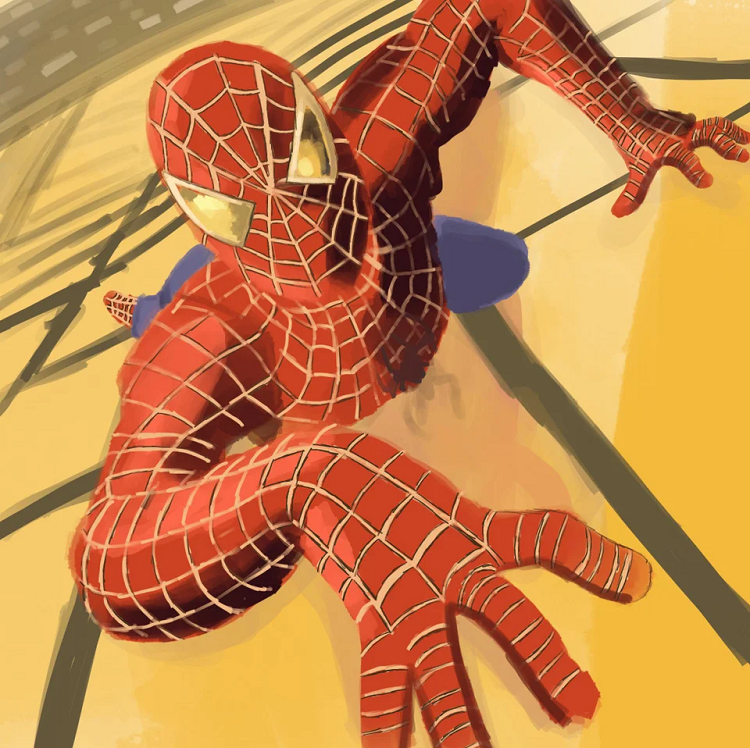
Spiderman from 2002, starring Tobey Maguire, had one of the most iconic superhero posters ever. It showcases Spiderman as he is climbing a building as if the image was taken from the top of the building. The poster perfectly sums up his powers, and up to this day, I remember how excited I was when I saw it.
As for this particular work, it is a recreation of the iconic poster. The background is a bit abstract; although you can obviously see it is a building, the lines are very awkward, and the same goes for the pavement below.
The superhero’s costume is made of red color with yellow lines, which differs from the color combinations used in the movie. In fact, I’d say that this drawing is not as good as most others on this list. However, due to sentimental value, I decided to add it nonetheless.
Pros
- Homage to the first Spiderman movie from 2022, which is why I had to add it.
- The creator fully utilized artistic freedoms, and you can tell it by the background.
Cons
- Certain body parts look very odd.
- The yellow patterns on his outfit don’t go well with the background; it is almost as if they’re merging with it.
15. “Spiderman catching an enemy” by banart
You can never go wrong with funny fan art. Although most people don’t want to hang drawings such as this over their bed, you can always use it as a desktop background.
The picture shows Spiderman, in regular street clothes, walking away from an apprehended enemy. The opponent is in a spider web cocoon, not being able to move an inch. He has a grumpy face, and his hair is upside down.
Anyway, I love this drawing as it is very silly. It has a Japanese art style vibe, and it goes well with the lore and the usual Spiderman panels. The colors are nice, and while the background is not necessarily impressive, it is quite jovial.
Pros
- I really like the aquamarine color for the background, even though it is not the best fit with the color of the spider web and the color of Spiderman’s clothes.
- The face of the villain is so silly, which instantly makes it cool in my book.
Cons
- The colors are a bit convoluted. They are a bit too similar for my taste, merging with each other in several places.
- It isn’t the best drawing. Certain parts look disproportionate (for example, Spiderman’s legs).
16. “Spiderman No Way Home” by William Puekker
This is one of my favorite fan art pieces, whether we’re talking about Spiderman or other superheroes. The drawing features three Spider-men, and when you hear this, you would probably think that the picture is convoluted, with too many unnecessary elements. In reality, it is everything but.
Although all three iterations of Spiderman are somewhat similar, they are also very different. They have a completely different feel to them, indicating that they’re from alternate time periods. The background is also awesome, looking like a real comic book background. It depicts NY buildings; they don’t interrupt the action in front, and I especially like the gentle colors.
If you’re looking for a new poster, you should definitely consider this art piece.
Pros
- Incredible art style. Nice colors and background that don’t interrupt the action.
- The three Spidermen are very similar yet, so different. They are very dynamic, and all their body parts are proportionate.
Cons
- Can’t complain about anything.
17. “Spider-Man: Into the Spider-Verse” by Alena Pavlycheva
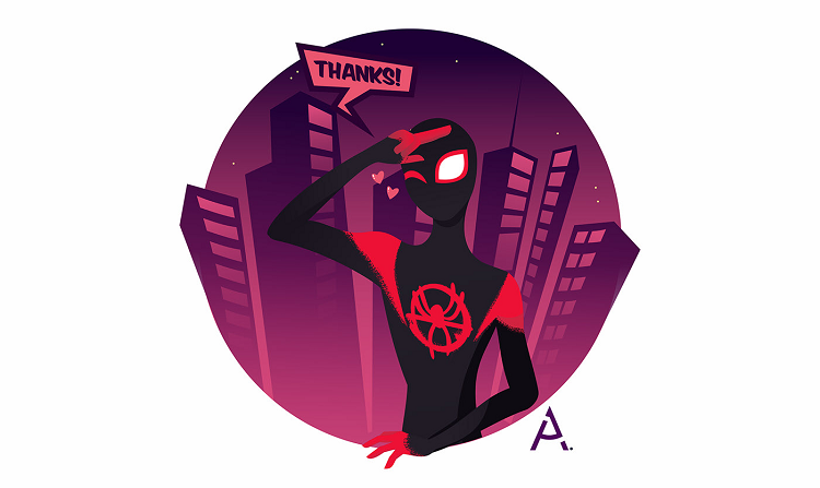
This isn’t actually one picture but a set of three images referencing “Spider-Man: Into the Spider-Verse.” It shows an interaction between Spiderman and Miles Morales. Basically, Miles is touching Spiderman’s outfit that proceeds to stretch as if it’s goo. He is quite surprised by this and thanks Spiderman afterward.
The set of drawings is completely different than anything else on the list. I love the art style, and especially the fade around the characters. The two costumes are completely different and provide a nice black and red contrast. What makes this a whole piece is the fact there is a storyline behind it.
Pros
- Cool art style; completely different from anything I’ve seen online.
- The contrast between the two characters is nice.
- I like the fact there is a story behind it.
Cons
- I don’t understand why Spiderman’s legs are bloodied.
18. “Spider-Man and Spider-Gwen” by kennethu
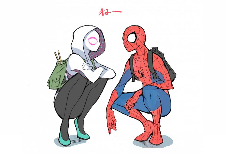
There are numerous drawings online that feature Spiderman and Spider-Gwen. This is one of the best I could find.
The two of them are squatting, facing each other. The photo is somewhat intimate, as they’re close to one another, and yet, there is no physical contact. In a way, it feels like they’re in a bubble. Even if you don’t know anything about Spiderman lore, you can clearly see that Gwen is a female based on her gentle calves and perky nose.
I simply love the color combinations. They are so different, and when you also consider the difference in terms of physical appearance, it makes for a nice contrast and composition. It looks as if the two superheroes are having friendly banter, which makes this image very unique compared to many others you can find on the web.
Pros
- Most fan art featuring Spiderman is excessively dynamic. This photo makes for a start contrast. Not only are the superheroes relaxed, but it also seems as if they’re enjoying each other’s company.
- The contrast between the two is really cool. Despite both being masked, you can see that one of them is a guy and the other one is a girl. The differences in colors and shapes are also incredible.
Cons
- You could argue that the drawing could benefit from a nice background. Then again, I feel that it would disrupt the image of the two superheroes in front of us.
FAQs
Question: What is the Best Spider-Man Fan Art?
Answer: There are so many great fan art pieces online that it is hard to choose just one of them. The best drawing I’ve seen has to be “It’s what we do” by Kelvin Does Things. This piece is extremely complex, with many small tributes and references. Of course, the artwork is also impeccable, and you can clearly see that the artist put their soul into this one.
Question: What is the Most Common Type of Spiderman Fan Art?
Answer: Fans use different themes as inspiration for their Spider-man drawings. In most cases, you will notice Spiderman alone, gliding the city by using his webs. There are also numerous fan arts that depict the three Spiderman actors together, as well as those that feature Spiderman and Venom in the same drawing.
Question: How to Use Spiderman Fan art?
Answer: Most Spiderman fan art is free to use. You can download it directly to your computer without having to pay anything. The majority of these drawings are posted on social media and specialized artistic platforms. You can use these pictures as background for your computer, or you can print them and put them as a poster or even a t-shirt.
Conclusion
Spiderman fans have created some incredible pieces over the years. Given the popularity of the character, it makes sense that he would be featured by some of the greatest content creators in the world.
My favorite piece is “It’s what we do” by Kelvin Does Things, but there are numerous other artworks that are worth your time. These drawings can be used in numerous ways, as posters for your room, desktop background, or as an inspiration for other art pieces.
Recommended Reads: